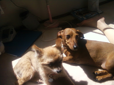
 This is a representational photo of my dogs (and someone's leg). It reports the details of that instant where my dogs were in my room with me hanging out in the sunlight. Along with being able to see the sloppiness and mess in my room, I could present this to someone to show what my dogs looked like. I could also just reminisce and remember the times I've had with both of them. The details are what makes the representation important and as you can see I had two different kinds of dogs (a Pomeranian and a Dachshund). Where there is less detail e.g. part of someone's leg, I couldn't tell you whom it belonged to - not that you cared to know.
Wednesday, December 9, 2009
Representational
 This is a representational photo of my dogs (and someone's leg). It reports the details of that instant where my dogs were in my room with me hanging out in the sunlight. Along with being able to see the sloppiness and mess in my room, I could present this to someone to show what my dogs looked like. I could also just reminisce and remember the times I've had with both of them. The details are what makes the representation important and as you can see I had two different kinds of dogs (a Pomeranian and a Dachshund). Where there is less detail e.g. part of someone's leg, I couldn't tell you whom it belonged to - not that you cared to know.
Symbolic
 This is the symbol seen almost on every block that means essentially nothing. It is the Starbucks symbol. It is absolutely minimal on visual detail making use of negative space to convey its message of "here's one of us!" This symbol means something to everyone, coffee drinker and not coffee drinker, as a place for drinking coffee (and doing laptop work). As a symbol, it's meaning is a learned attribute as the image within, a queen mermaid-ish thing, has nothing to do with coffee. The fact that you see these everywhere on coffee cups or on plenty of street corners, helps develop the associated meaning of coffee from Starbucks.
Abstract
Tuesday, December 8, 2009
Week 13 Blog: Visual Techniques
The two designs I have are of the BMW GINA Concept Car and the Wii News Channel Interface. Where the two designs differed in techniques used, there was transparency used in the tail brake lights that emanate through the skin of the BMW GINA Concept and many overlapping parts of names of areas and the articles gave the Wii News Channel a usage of opacity. A mixture of distortion and subtlety is exemplified by the BMW GINA Concept in its skin's "wrinkles" as you realize, "Hey, a car's not supposed to wrinkle!" Whereas a mix of Fragmentation, Activeness, and Depth play on the interactivity suggested by its multiple icons of articles, motion implied by the pointed finger, and the dimension created by a stack of articles and shape of the globe. What the two designs share are depth, denoted by the BMW's curves, lines and capturing of different shades of light on different angles of the car.
Images from: http://gizmodo.com/assets/resources/2007/01/wiinews23wm.jpg
http://www.goodlife.com.ng/uploads/Sanni-Azeez_41_BMW-GINA-20.jpg
http://www.fahad.com/pics/bmw_gina_concept_car.jpg
Subscribe to:
Comments (Atom)
