 While this may not look like the most colorful and tonal object, I feel like those particular features on this item might be easily overlooked. This is the HTC touch diamond. I encountered this item when I happened to meet a friend of mine who has it. When I held it in my hand, I immediately played around with the indented circle at the bottom center of the phone. Looking at the device, there is a certain tonal feature to that particular area and it is done by natural lighting. The shape of it just tends to capture light at different angles and what you see is a shape that encompasses light and darkness. Catching light in one angle will cause darkness at another. You can't quite say that the look of it alone represents its dimension because it not only expresses dimension but in that its indented, it is itself dimension. That lighting effect, shows that there is an apparent inward direction. And as its slightly popping forward, shows theres an outward direction as well (can only slightly see with shown picture). This shows its dimension and allows you to realize its something to interact with being 3d. With regards to color, shown are the windows symbol which is a very identifiable icon (red, green, blue, and yellow at top left, incase it was necessary to point out) and a simple green circular dot (with a '1' in it) appearing over the bottom of a message icon. Immediately, I know the windows icon (with 'start' next to it) is how I would access deeper features of the phone. Also, that I have 1 (text/email) message. There is so much meaning that follows the presence of color that I can see with a simple glimse at this phone. Color in addition to shape (the shape of the window symbol and the fact that there is the shape of a message symbol under that of the dot of green) unify to create an abundance of meaning. The shape defines the color in order to create an overall symbol with which we would make out a meaning for.
Sunday, October 25, 2009
Tone and Color
While this may not look like the most colorful and tonal object, I feel like those particular features on this item might be easily overlooked. This is the HTC touch diamond. I encountered this item when I happened to meet a friend of mine who has it. When I held it in my hand, I immediately played around with the indented circle at the bottom center of the phone. Looking at the device, there is a certain tonal feature to that particular area and it is done by natural lighting. The shape of it just tends to capture light at different angles and what you see is a shape that encompasses light and darkness. Catching light in one angle will cause darkness at another. You can't quite say that the look of it alone represents its dimension because it not only expresses dimension but in that its indented, it is itself dimension. That lighting effect, shows that there is an apparent inward direction. And as its slightly popping forward, shows theres an outward direction as well (can only slightly see with shown picture). This shows its dimension and allows you to realize its something to interact with being 3d. With regards to color, shown are the windows symbol which is a very identifiable icon (red, green, blue, and yellow at top left, incase it was necessary to point out) and a simple green circular dot (with a '1' in it) appearing over the bottom of a message icon. Immediately, I know the windows icon (with 'start' next to it) is how I would access deeper features of the phone. Also, that I have 1 (text/email) message. There is so much meaning that follows the presence of color that I can see with a simple glimse at this phone. Color in addition to shape (the shape of the window symbol and the fact that there is the shape of a message symbol under that of the dot of green) unify to create an abundance of meaning. The shape defines the color in order to create an overall symbol with which we would make out a meaning for.
Tuesday, October 13, 2009
User Interface Design

Color. This interface for a game called, World of Warcraft, shows the use of colors to denote meaning. The most generally universal color-meaning association in the genre, MMO, is probably the one that distinguishes Health (in green) and MP/Mana (in blue). Shown in these colors range from the gauges showing maximum health and mana and in health and mana generation from abilities on screen by the character at center in colored numeral.

Tone. In this interface for the Sony Ericsson, tone is the major factor that allows a user to select their function of choice. Shown, a camera icon is illuminated in a light that contrasts between the other icons that are in darkness. Also, the name of the function choice is in a much brighter shade than that of the icons as well. The effect is that the user knows what they are about to select with the cue besides that of the icon -- the name of the function.
image from: http://sefanboy.com/2007/11/26/k850-menu-interface-in-k810k800/
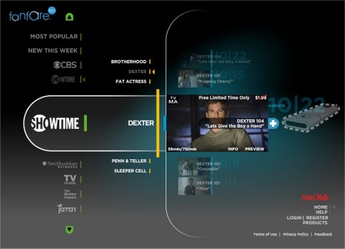 The Line. This interface for a TV program video player makes an interesting use of lines. Just the simple use of lines in this particular interface shows movement of sub-menus that further show multiple programs within a channel. These lines show depth and allow a user to realize that there are an abundance of options to choose from. They also make the channel and program the focus of attention.
image from: www.slipperybrick.com/
Tuesday, October 6, 2009
Week 6 Blog

While this first picture shows a very texturized and flashy look at what this game (Final Fantasy XIII) might play like in battle when it is bought by many FF series fans, the design of the interface doesn't help a gamer understand how to make it all happen. Much of the stress in the interface causes the gamer to look at the corners of the screen which appears as something that looks like a map and another circular gauge meter type thing on the top left and right of the screen shot. A map you may be able to understand intuitively but, traditionally in this game genre (RPG), maps are not the most necessary thing when it comes to a fight/battle. It may even sound ridiculous to one who has not the least bit of interest in this type of game to hear about reading a map in battle. Secondly, the gauge or meter isn't even labeled as complex as it looks. Looking near the bottom of the picture, more of the interface is displayed. A list of actions are scrolled on the bottom left diagonally in what order, I'm unsure of. It is missing a hierarchy, being group together in a seemingly random order. In the middle of the bottom interface, there seems to be the possibility of chaining actions, it must correspond to the color of the action selected in the random list of abilities. The last two of the chain action interface is empty but how is one to know whether or not they can enter another two abilities or not? Lastly, the amount of health the player has is shown as just a number, not a fraction to show how much in total, next to another number labeled ATB then there is a green bar on top of these numbers. Maybe the bar corresponds to health or ATB but its a little hard to tell.
There is a waste of stress toward the two items on the top, and no order to the bottom where one is supposed to choose actions to function. On top of that, important information about the character is cluttered to the bottom right.
 In this second image, displayed is a newer concept of the battle system interface. The map is gone, and the gauge that was on the top right has been simplified. Along with the simplification is some added meaning with the numbers and words "Bonus" and "chain." Perfect to fix what was wrong with the old interface. The functional interface on the bottom has changed as well. The clutter of information has been split in to the left and right helping balance out the overload of information in one enclosed space. The action interface has a certain order and the ATB number seems to have been replaced with a much more simple design of whole single digit numbers as opposed to the hundreds and tens used in the old interface. There is even some depth to show difference of grouping that there are abilities to choose from outside the bracket of abilities indicated with a hand.
images from: http://xbox360.qj.net/Comparing-the-old-and-new-Final-Fantasy-XIII-battle-interface/pg/49/aid/127767
http://static.gamesradar.com/images/mb//GamesRadar/us/Games/F/Final%20Fantasy%20XIII/Bulk%20Viewers/PS3/FFXIII_battle1--screenshot_large.jpg
Subscribe to:
Comments (Atom)
