 This is a representational photo of my dogs (and someone's leg). It reports the details of that instant where my dogs were in my room with me hanging out in the sunlight. Along with being able to see the sloppiness and mess in my room, I could present this to someone to show what my dogs looked like. I could also just reminisce and remember the times I've had with both of them. The details are what makes the representation important and as you can see I had two different kinds of dogs (a Pomeranian and a Dachshund). Where there is less detail e.g. part of someone's leg, I couldn't tell you whom it belonged to - not that you cared to know.
Wednesday, December 9, 2009
Representational
This is a representational photo of my dogs (and someone's leg). It reports the details of that instant where my dogs were in my room with me hanging out in the sunlight. Along with being able to see the sloppiness and mess in my room, I could present this to someone to show what my dogs looked like. I could also just reminisce and remember the times I've had with both of them. The details are what makes the representation important and as you can see I had two different kinds of dogs (a Pomeranian and a Dachshund). Where there is less detail e.g. part of someone's leg, I couldn't tell you whom it belonged to - not that you cared to know.
Symbolic
 This is the symbol seen almost on every block that means essentially nothing. It is the Starbucks symbol. It is absolutely minimal on visual detail making use of negative space to convey its message of "here's one of us!" This symbol means something to everyone, coffee drinker and not coffee drinker, as a place for drinking coffee (and doing laptop work). As a symbol, it's meaning is a learned attribute as the image within, a queen mermaid-ish thing, has nothing to do with coffee. The fact that you see these everywhere on coffee cups or on plenty of street corners, helps develop the associated meaning of coffee from Starbucks.
Abstract
 This is an abstracted image of a face. The "face" we see here is seen in reduction of details of a face into blobs of different colors. Seeing this image as a thumbnail before the full image, gave the immediate response of recognizing a face perhaps through minimizing the size further subtracts from detail. The minimal representational detail that exists are the outline of the head and body that are not the face in black scribble and the areas where one expects eyes to be in blue and lips a pink color. This face is not a specific face but an abstracted face for all faces. At first I thought it was a female face, but looking up close all I can say is that its a face.
Tuesday, December 8, 2009
Week 13 Blog: Visual Techniques

 Depth, Distortion, Transparency, Symmetry, Subtlety
 Fragmentation, Activeness, Opacity, Variation, Depth
The two designs I have are of the BMW GINA Concept Car and the Wii News Channel Interface. Where the two designs differed in techniques used, there was transparency used in the tail brake lights that emanate through the skin of the BMW GINA Concept and many overlapping parts of names of areas and the articles gave the Wii News Channel a usage of opacity. A mixture of distortion and subtlety is exemplified by the BMW GINA Concept in its skin's "wrinkles" as you realize, "Hey, a car's not supposed to wrinkle!" Whereas a mix of Fragmentation, Activeness, and Depth play on the interactivity suggested by its multiple icons of articles, motion implied by the pointed finger, and the dimension created by a stack of articles and shape of the globe. What the two designs share are depth, denoted by the BMW's curves, lines and capturing of different shades of light on different angles of the car.
Images from: http://gizmodo.com/assets/resources/2007/01/wiinews23wm.jpg
http://www.goodlife.com.ng/uploads/Sanni-Azeez_41_BMW-GINA-20.jpg
http://www.fahad.com/pics/bmw_gina_concept_car.jpg
Tuesday, November 10, 2009
Contrast in Design
 Here we have a menu interface from a game called Age of Pirates 2. There is contrast in this interface in the fact that there is a menu in the middle of the screen over a detailed look of the theme of pirates and ruined ships at sea. The words "Load Game" are notably brighter than the others perhaps denoting that it is selected at the moment. The symbolic icon of the game stands out as an item completely separate from the background as is with the words and lettering of the menu. With the menu slightly more to the left than center, there is a bit of sharpening going on allowing users to see more of what the game has to offer in terms of its graphics or theme to the right as well as choosing what selection is desired. Also, in the background, we can see skies that are quite clear and blue higher up although lower and in the distance you see a darkening, attributing to the theme of entering into a pirate's world. Although it was unexpected to see such clear skies, it has a good feel to it probably because it sets a mood.
image from: http://i4.photobucket.com/albums/y116/oleman/Puzzel6.jpg
 Shown is an image of an option menu interface for a game called Fireteam. This is an example of an interface that uses little contrast and where it does use contrast, it fails to use it in a way that serves a good purpose in design. This interface has contrast in color between the brown boxy features and the blue background however it lacks contrast in shape and has just a few textures in juxtaposition of each other. Each of tProxy-Connection: keep-alive
Cache-Control: max-age=0
box shaped features are exactly alike differing only in the text within them. In addition, the font sizes of "SOUND" and "REMAP KEYS" are significantly greater in size than the others causing a point of focus that seems unnecessary. I actually was expecting to see options within the boxes but realized later that this is the options menu, this was likely at fault to the texture of the word option matching that of the blue background.
image from: http://www.silverthornedesign.com/images/FTI_03.jpg
Tuesday, November 3, 2009
Movement and Motion in Environment Design
 Shown above is the game Fable 2. Much of the environment is made to be acted on in order to perhaps jump over a fence for example. This would normally occur as you come within a certain distance of reach of course. The human perception of motion allows us to realize that a distance is closing as we move toward it with the use of flow of movement. The use of this movement along with depth perception come hand in hand with a human's perspective of space. Just as you wouldn't try jumping over a fence that was too far, naturally this aspect is used in the game Fable 2.
http://scathingaccuracy.com/pageFiles/review/images/fable%202/fable-2.jpg
 Shown in this image is the simulated reality, PS3 Home. The environment is made to show users which directions and locations are accessible. Seen in a distance, a light tan circular area is a location we can see a gathering of users. On the right, we see another users running toward the current user's perspective through the use of a stairway. These are just some of the ways to make users realize and make use of the depth to the environment that the Home creators made to imply areas to move toward. While not shown in this image, the user who access the device shown has the option to look around the device which I find to be a very good use of motion just as though you would turn your head in attention to something else.
http://media.obsessable.com/media/2008/12/12/29-basiccontrols2.jpg
Depth/Dimension/Space
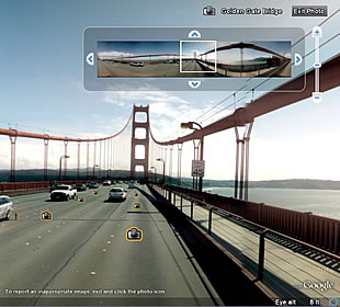 Here is an example of Google Earth's street view on the Golden Gate Bridge. As it is a 2D representation of 3D, we can make out certain elements within dimension to create a depth perception. Use of overlap of a speed limit sign in front of a line of cables show depth acting in space. The parallel lines of the sides of the bridge converge into a vanishing point. And the eyes are deceived as thought they were peering into a distance although all there really is a horizon where all lines tend to meet at the vanishing point. The lines of cables get smaller showing scale to create more depth to allow us to perceive space. These make use of relative height and size. They create a certain texture gradient as well.
http://earth.google.com/intl/en_uk/userguide/v5/images/street_view.jpg
Sunday, October 25, 2009
Tone and Color
 While this may not look like the most colorful and tonal object, I feel like those particular features on this item might be easily overlooked. This is the HTC touch diamond. I encountered this item when I happened to meet a friend of mine who has it. When I held it in my hand, I immediately played around with the indented circle at the bottom center of the phone. Looking at the device, there is a certain tonal feature to that particular area and it is done by natural lighting. The shape of it just tends to capture light at different angles and what you see is a shape that encompasses light and darkness. Catching light in one angle will cause darkness at another. You can't quite say that the look of it alone represents its dimension because it not only expresses dimension but in that its indented, it is itself dimension. That lighting effect, shows that there is an apparent inward direction. And as its slightly popping forward, shows theres an outward direction as well (can only slightly see with shown picture). This shows its dimension and allows you to realize its something to interact with being 3d. With regards to color, shown are the windows symbol which is a very identifiable icon (red, green, blue, and yellow at top left, incase it was necessary to point out) and a simple green circular dot (with a '1' in it) appearing over the bottom of a message icon. Immediately, I know the windows icon (with 'start' next to it) is how I would access deeper features of the phone. Also, that I have 1 (text/email) message. There is so much meaning that follows the presence of color that I can see with a simple glimse at this phone. Color in addition to shape (the shape of the window symbol and the fact that there is the shape of a message symbol under that of the dot of green) unify to create an abundance of meaning. The shape defines the color in order to create an overall symbol with which we would make out a meaning for.
Tuesday, October 13, 2009
User Interface Design

Color. This interface for a game called, World of Warcraft, shows the use of colors to denote meaning. The most generally universal color-meaning association in the genre, MMO, is probably the one that distinguishes Health (in green) and MP/Mana (in blue). Shown in these colors range from the gauges showing maximum health and mana and in health and mana generation from abilities on screen by the character at center in colored numeral.

Tone. In this interface for the Sony Ericsson, tone is the major factor that allows a user to select their function of choice. Shown, a camera icon is illuminated in a light that contrasts between the other icons that are in darkness. Also, the name of the function choice is in a much brighter shade than that of the icons as well. The effect is that the user knows what they are about to select with the cue besides that of the icon -- the name of the function.
image from: http://sefanboy.com/2007/11/26/k850-menu-interface-in-k810k800/
 The Line. This interface for a TV program video player makes an interesting use of lines. Just the simple use of lines in this particular interface shows movement of sub-menus that further show multiple programs within a channel. These lines show depth and allow a user to realize that there are an abundance of options to choose from. They also make the channel and program the focus of attention.
image from: www.slipperybrick.com/
Tuesday, October 6, 2009
Week 6 Blog

While this first picture shows a very texturized and flashy look at what this game (Final Fantasy XIII) might play like in battle when it is bought by many FF series fans, the design of the interface doesn't help a gamer understand how to make it all happen. Much of the stress in the interface causes the gamer to look at the corners of the screen which appears as something that looks like a map and another circular gauge meter type thing on the top left and right of the screen shot. A map you may be able to understand intuitively but, traditionally in this game genre (RPG), maps are not the most necessary thing when it comes to a fight/battle. It may even sound ridiculous to one who has not the least bit of interest in this type of game to hear about reading a map in battle. Secondly, the gauge or meter isn't even labeled as complex as it looks. Looking near the bottom of the picture, more of the interface is displayed. A list of actions are scrolled on the bottom left diagonally in what order, I'm unsure of. It is missing a hierarchy, being group together in a seemingly random order. In the middle of the bottom interface, there seems to be the possibility of chaining actions, it must correspond to the color of the action selected in the random list of abilities. The last two of the chain action interface is empty but how is one to know whether or not they can enter another two abilities or not? Lastly, the amount of health the player has is shown as just a number, not a fraction to show how much in total, next to another number labeled ATB then there is a green bar on top of these numbers. Maybe the bar corresponds to health or ATB but its a little hard to tell.
There is a waste of stress toward the two items on the top, and no order to the bottom where one is supposed to choose actions to function. On top of that, important information about the character is cluttered to the bottom right.
 In this second image, displayed is a newer concept of the battle system interface. The map is gone, and the gauge that was on the top right has been simplified. Along with the simplification is some added meaning with the numbers and words "Bonus" and "chain." Perfect to fix what was wrong with the old interface. The functional interface on the bottom has changed as well. The clutter of information has been split in to the left and right helping balance out the overload of information in one enclosed space. The action interface has a certain order and the ATB number seems to have been replaced with a much more simple design of whole single digit numbers as opposed to the hundreds and tens used in the old interface. There is even some depth to show difference of grouping that there are abilities to choose from outside the bracket of abilities indicated with a hand.
images from: http://xbox360.qj.net/Comparing-the-old-and-new-Final-Fantasy-XIII-battle-interface/pg/49/aid/127767
http://static.gamesradar.com/images/mb//GamesRadar/us/Games/F/Final%20Fantasy%20XIII/Bulk%20Viewers/PS3/FFXIII_battle1--screenshot_large.jpg
Tuesday, September 29, 2009
Week 5 blog

I chose this picture of an anime (and manga) called, Tengen Toppa Gurren Lagann, because from early on in my life animations have impacted my interests in Japanese culture. While this isn't directly from one of the episodes (or volumes), this speaks a great amount just as a poster or promotional flier. This picture simply introduces the major characters of this anime. From a perspective of one who hasn't seen this animation, immediately you'll notice the 3 characters in the middle... it's not a bad thing if you first noticed just one of them. They each have different expressions. The man in the middle is pointing upward toward a flash of light seems as though he is set on reaching high goals. The woman to the right in a bold choice of attire, swung her rifle to her back, ready to fight in striving toward this upward goal with joy. The boy in the foreground shows determination gripping the item in his hand with wide eyes symbolizing his youthful innocence. Off the bat, characteristics shine through just simple animation styles which amazes me. In the background, you may have focused on the shape of what appears to be a robot, though you may have not noticed beforehand due to it being shaded blue and placed behind the first 3 characters with more light and color falling on them. Then, behind even the robot, you have 2 more characters who seem to have a certain shade of color over them as well. The man on the right is mysterious seeing only his left eye though evil looking with a grin at the same time. The girl on the left behind the robot, being a bit more exposed than the man on the right is a bit less mysterious with a look of pure innocence on her face and in her eyes. With seeing just as much, you might have a good idea of what these characters are like and maybe choose to watch or read this story. Oops, I missed a character... the mole on the boy's shoulder, who is obviously loyal staying steady on the shoulder, also looking upward. To those familiar to Japanese animation or culture (even just faintly), may recognize the crescent on top of the robot's head which is like that of a samurai warrior. Even the woman on the right with the look of chopsticks in her hair is an allusion to Japanese culture.
Whether from actions, facial expressions or characteristics, allusions, or simply a matter of being in the foreground, a character introduction isn't necessary with all the hints in a cover or picture of an animation. A picture is really worth a thousand words, if not more.
Tuesday, September 22, 2009
Visual Thinking Research
 For this Snake game, we arrived at the same conclusion that the red snake was the shortest. My strategy was simply to trace the snake with my mouse in quarters of circles, counting every 1/4 of a circle. According to my friend, she just saw that it was short... I'm not sure I believe her.
 I was looking for a rule in this game and happened to rule out the right answer. I thought that most of the shapes to choose from shape-position tie that didn't occur in the first 4. So I ruled out A, B, and C right away. E just didn't make sense to me after the first box had a diagonal then a square, but it was the right one...>< Meanwhile, my friend said what she did was connect lines to make sense out of it. However, we both fail at this one.
Tuesday, September 15, 2009
Feature Channels and Visual Search
 This is the old user interface for the playstation3 -- the new one is similar just more sparkly and in effect makes the rest look a bit more colorful. This is a rather monochromatic example of the interface but no matter what colors used the functions are featured through icons. Simply identified you may notice the photos icon depicted by a camera, music by a musical note, movies by a film strip, games by the ps3 controller, web access through a grid ridden globe, friend access with two faces, settings with a toolbox and finally user selection with a face imprinted on a generic house shape. The functions with in the featured icons would spring up and downward for more specific tasks having to do with a particular icon making visual search almost a strict upward-downward search. With the concern in hierarchy, I think that the ps3 interface keeps everything similar meaning none should be more played with than any of the other features. The one icon you would select would become brighter and spew out the specific features which would glow depending on which you would like to select. I like how simple it is but it might be a bit too simple.
image from: http://www.joystiq.com/tag/user-interface/
Monday, September 14, 2009
Top-Down Visual Processing

I thought this is a good example of top-down visual processing because looking at this picture, I'm pretty sure it's not features you bother to look at first but rather many full-sized creatures. If you were at a scene like this, what you'd be thinking is probably, "I should get out of here, slowly, not too suddenly might be a good idea..." and not how fluffy they look. I chose this picture because it reminded me of a time I saw a whole squad of raccoons marching across the street of my home and how I didn't sit there to take in the scene but thought what would be a good reaction in case they were to rush at me after taking the trash out. My top-down visual processing was making a goal for me to get out of there should anything happen. I was fixated on the raccoons and how many there were thinking about whether it was safe to move in sudden motions or not. I ended up standing there until they continued on their path but was ready as ever to run back inside if they headed toward me.
image from: http://nirvanapeace.wordpress.com/2008/12/
and apparently: http://icanhascheezburger.com/
Subscribe to:
Comments (Atom)
